DCES measurements in Jupyter
Jupyter notebooks are very convenient to share reports with others.
Those reports are accessible in a web brower and I can share those within my team: if the report is not fitting one needs, he can freely edit it and render his own version.
Additionally, the notebooks can be converted to static html pages for external readonly access.
How it works
This notebook retrieves the data logged by DCES instances for an Influxdb database.
Then it plots heatmaps of the maximum readings for dust, temperature and humidity and diplay those using plottly.
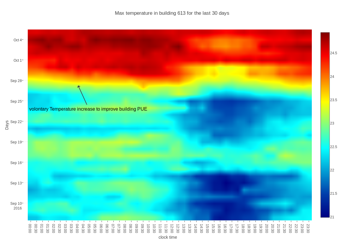
Heatmaps allow to visualize a lot of information in a single graph: the days are on the Y axis and clock time is on the X axis. Since most trends for environmental data repeat every day: the air gets colder during nights, warmest time is around lunchtime… We can spot those recurrent phenomena piling up vertically because they occur at approximately the same time everyday. Similarly human activity caused anomalies occur everyday during working hours.
It allows anyone to zoom in on all the data for specific detected anomalies.
One example
For example we can easily spot that temperature increased inside the building: this was a volontary temperature increase to improve the global power efficiency of the building:

Here is an example Jupiter notebook showing DCES measurements in CERN building 613 between September 8 and October 5 2016.